 Skip to content
Artwork Planning
What Logo Details Do Not Work Well on Custom Light-Up Pins
The best custom light-up pin is not always the most literal version of the logo. It is the version people can recognize quickly when the pin is small, worn, moving, and blinking.
Start by Deciding What Someone Must Recognize From a Few Feet Away
A logo on a website, banner, or business card can carry fine print, layered texture, subtle gradients, and detailed secondary marks. A custom light-up pin has a different job. It has to read while someone is wearing it on a jacket, shirt, badge strap, or event lanyard, often while the person is moving through a crowd.
That is why the first artwork question is not “Can we copy the logo exactly?” The better question is: which one or two things have to survive instantly? For some buyers that is the outside shape. For others it is a mascot face, initials, a campaign color, a product silhouette, or a sponsor mark that needs to stay clean.
Fine Print, Hairline Strokes, and Busy Backgrounds Usually Need a Pin-Sized Version
- Small taglines can turn into noise if they are forced into a narrow shape instead of handled as a larger printed area or removed from the pin version.
- Thin outlines may disappear beside LEDs, metallic finishes, or dark garment colors, especially when the viewer sees the pin from a few steps away.
- Gradients, shadows, and photo-like textures often need to become simpler color blocks before the proof can show a reliable production direction.
- Stacked icons, seals, and dense anniversary marks may need one hero element instead of trying to preserve every ring, ribbon, date, and sponsor line.
This does not mean the brand has to become generic. It means the wearable version should protect the part of the logo that matters most and avoid spending the whole budget on detail that people cannot read.
Colors That Look Great on Screen Can Lose Contrast on a Small Blinking Object
Brand colors still matter, and Pantone targets can help keep the printed design closer to the official palette. The risk is contrast. Two dark tones that look sophisticated on a monitor can collapse together on a small printed pin. Pale colors can also feel weaker once the LED effect becomes the brightest part of the object.
For strict brands, the quote request should mention required Pantone values and any colors that cannot shift. The proof conversation can then separate brand accuracy from readability. If a color must stay exact, another part of the layout may need to work harder: a cleaner outline, larger type, fewer internal details, or LED placement that emphasizes the right feature.
LEDs Should Mark the Focal Point, Not Repair a Crowded Logo
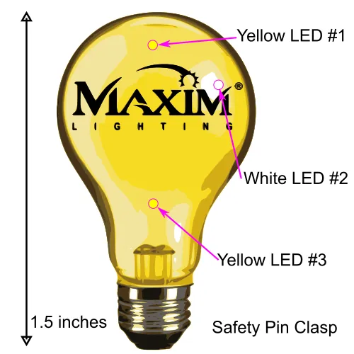
LED lights are strongest when they have a specific job: light the star, highlight the window, make the mascot eyes pop, trace the product idea, or signal the part of the mark people should notice first. They are weaker when used as a patch for artwork that already has too much going on.
If the logo has many small features, pick the light locations after choosing the pin’s first read. A single strong LED idea can feel more intentional than five lights fighting with tiny type, tight curves, and low-contrast print.
Use This Artwork Triage Before Asking for a Quote
| Logo Issue | Better Pin Direction |
|---|---|
| Long tagline under the mark | Use the primary logo shape on the pin and keep the tagline for packaging, event signage, or a larger printed insert. |
| Thin script or hairline border | Thicken the key strokes or let the outside shape carry the identity while the fine line becomes a simpler printed accent. |
| Gradient-heavy artwork | Convert the proof direction to a smaller set of solid colors so the finished pin does not depend on screen-only effects. |
| Detailed mascot or seal | Choose the face, silhouette, initials, or central icon as the hero element instead of forcing every small ring and label into the pin. |
| Multiple possible light spots | Pick the LED locations that explain the design fastest, then leave the remaining details as print or remove them. |
A Strong Proof Often Looks Simpler Than the Original File
That is normal. The proof is where the logo becomes a small manufactured object with an outside shape, printed color, LED behavior, clasp choice, and real wearer context. When a proof removes clutter, it is usually trying to protect recognition rather than weaken the brand.
Send the File That Lets the Production Team Separate Shape, Print, and Light
Editable vector artwork is best because it lets the team inspect the outline, simplify internal detail, confirm colors, and test where the LED locations make sense. A high-resolution image can start the conversation, but a vector file usually makes the proof cycle cleaner.
If the logo has strict brand rules, send those too. The Pantone color matching guide explains where color accuracy fits, while the proof process article shows why artwork, LEDs, and shape should be reviewed together.
What to Tell LogoBlinkee When Your Artwork Is Complicated
Send the original logo file, the event date, the likely quantity, the wearer group, and a short note about what cannot change. If the tiny text must stay, say so. If the mascot shape matters more than the words, say that. If the color is locked by a sponsor or school brand guide, include the target values before the first proof.
Buyers who are still choosing a direction can compare finished examples in the portfolio, rough out a visual idea in the Blinky Builder, or review how a logo becomes a light-up pin before starting the quote.
Ask for a Pin Version of the Logo, Not Just a Smaller Logo
Send the editable artwork, deadline, quantity range, and the detail you most need to protect. LogoBlinkee can help turn the mark into a light-up pin that still reads when people wear it.
Questions Buyers Ask When Their Logo Has Tiny Details
Can every logo be turned into a custom light-up pin?
Most logos can be adapted, but the best pin version may simplify tiny type, hairline strokes, shadows, gradients, or background texture so the finished piece stays clear at wearable size.
What details should I expect to simplify first?
Small taglines, crowded seals, complicated textures, overlapping icons, and low-contrast color combinations are common places to simplify before the proof locks in shape and LED placement.
Will adding more LEDs make a detailed logo easier to read?
Usually no. More LEDs can add attention, but they do not fix unreadable art. A cleaner focal point with one or two intentional light locations often works better.
What file type helps most when the logo is detailed?
Editable vector artwork is the best starting point because it gives the production team room to separate the outline, printed details, brand colors, and possible LED locations.